You are here
How to Make Graphs on EPDC.org
EPDC offers six ways to visualize your data.
You can turn your search results into a graph in 3 easy steps:
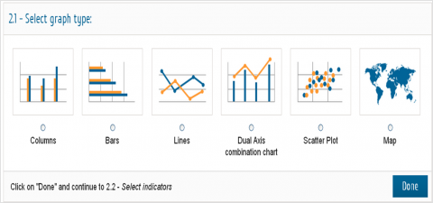
Step 2.1 - Select graph type
Step 2.2 - Select indicators
Step 2.3 - Select dimensions and configure your graph
All of the data provided by EPDC are comprised of 10 dimensions. With EPDC's data vizualization tool, you can compare values across 1, 2 or 3 dimensions depending upon the type of graph you select. After you select which dimension you would like to compare, you must specify 1 value for each of the remaining dimensions. See below for instructions on how to configure each type of graph:
Column Chart: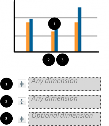
Selection of indicators on 2.2:
Select one or more indicators of the same unit.
Instructions for configuration of data visualization on 2.3:
If only one indicator was selected:
- Drag and drop a maximum of three dimensions on the available containers #1, #2 and #3 under Configure graph.
- Dimensions on containers #2 and #3 will be combined on the X axis.
If more than one indicator was selected:
- Drag and drop a maximum of two dimensions on the available containers under Configure graph.
- Dimensions on containers #2 and #3 will be combined on the X axis.
Bar Chart: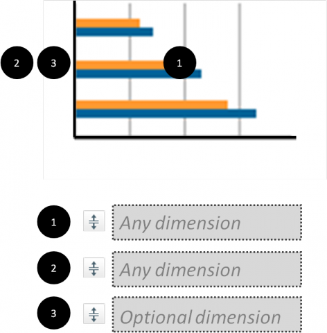
Selection of indicators on 2.2:
Select one or more indicators of the same unit from the list below
Configuration of data visualization on 2.3:
If only one indicator was selected:
- Drag and drop a maximum of three dimensions on the available containers #1, #2 and #3 under Configure graph.
- Dimensions on containers #2 and #3 will be combined on the Y axis.
If more than one indicator was selected:
- Drag and drop a maximum of two dimensions on the available containers under Configure graph.
- Dimensions on containers #2 and #3 will be combined on the Y axis.
Line Chart: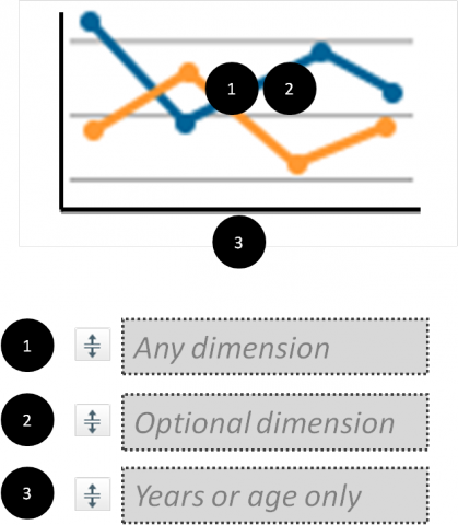
Selection of indicators on 2.2:
Select one or more indicators of the same unit.
Configuration of data visualization on 2.3:
If only one indicator was selected:
- Drag and drop the dimension Years or the dimension Age Group on the container #3 (X axis), under Configure graph.
- Drag and drop a maximum of two more dimensions on the available containers #1 and #2. These dimensions will be combined and be represented as lines of different colors on the final chart.
If more than one indicator were selected:
- Drag and drop the dimension Years or the dimension Age Group on the container #3 (X axis), under Configure graph.
- Optional: Drag and drop another dimension on the available container. This dimension will be combined with the selected indicators, and be represented as lines of different colors on the final chart.
Dual Axis Chart: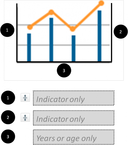
Selection of indicators on 2.2:
Select exactly two indicators. The indicators can be of different units.
Configuration of data visualization on 2.3:
- Drag and drop the dimension Years or the dimension Age Group on the container #3 (X axis), under Configure graph.
- Selected indicators are placed on containers #1 and #2, and you can swap their position. Indicator on container #1 will be represented as lines and indicator on container #2 will be represented as columns.
Scatter Plot Chart: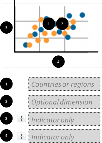
Selection of indicators on 2.2:
Select one indicator.
Configuration of data visualization on 2.3:
- If you would like to compare National level data across countries
- Drag and drop the dimension Countries or the dimension Subnational units on the container #1 under Configure graph. If you drag and drop Subnational units, make sure to have only one value selected under the dimension Countries, or place Countries on container #2.
- Drag and drop a dimension with only two values selected on container #3 or #4. Each value will be located on those containers and you can swap their positions. Value on container #3 will be placed on the Y axis and value on the container #4 will be placed on the X axis.
- Optional: Drag and drop another dimension on container #2. Containers #1 and #2 will be combined, and combined values will be represented in different colors on the chart.